Mercantile 37
Mercantile 37 is an artisan showroom founded by JR and Nick Roudebush, a father and son team. JR and Nick both sold their custom wares independently before coming together to open the Mercantile 37. The Mercantile offers vintage and handcrafted furniture, housewares, supplies, and decor from local artisans, and their building is also home to the charming Wheeler’s Cafe.
Rebecca Hoskins for Marion Design Co.
Process
Working with Marion Design Co., I had the pleasure of assisting in the brand identity design for Mercantile 37. After talking with Nick Roudebush about his vision for the business, we dove right into visual exploration and mind-mapping, creating personas to capture the people that JR and Nick wanted to reach. From there, our team spent our time sketching, exploring hand-painted lettering, vintage signs, and countless number forms.
Visual Exploration
We expanded on the themes: vintage, handcrafted, industrial, and local. Old, hand-painted signage was the driving aesthetic for what the Mercantile 37 wanted to emulate from a strategic point of view and the preferences of JR and Nick Roudebush. Our moodboards included vintage typography from many different sectors as well as imagery that encompassed the textures, spaces, and objects that would comprise the Mercantile’s visual tone.
After basing our moodboards on this aesthetic, our sketches focused on a hand-drawn wordmark. The number “37” was a key piece with potential to become a focal point for the brand, and we knew that this piece of the mark would have to be custom. Within these confines, we explored many hand-drawn and digitally rendered options for both the wordmark and the “37.”
The Brand
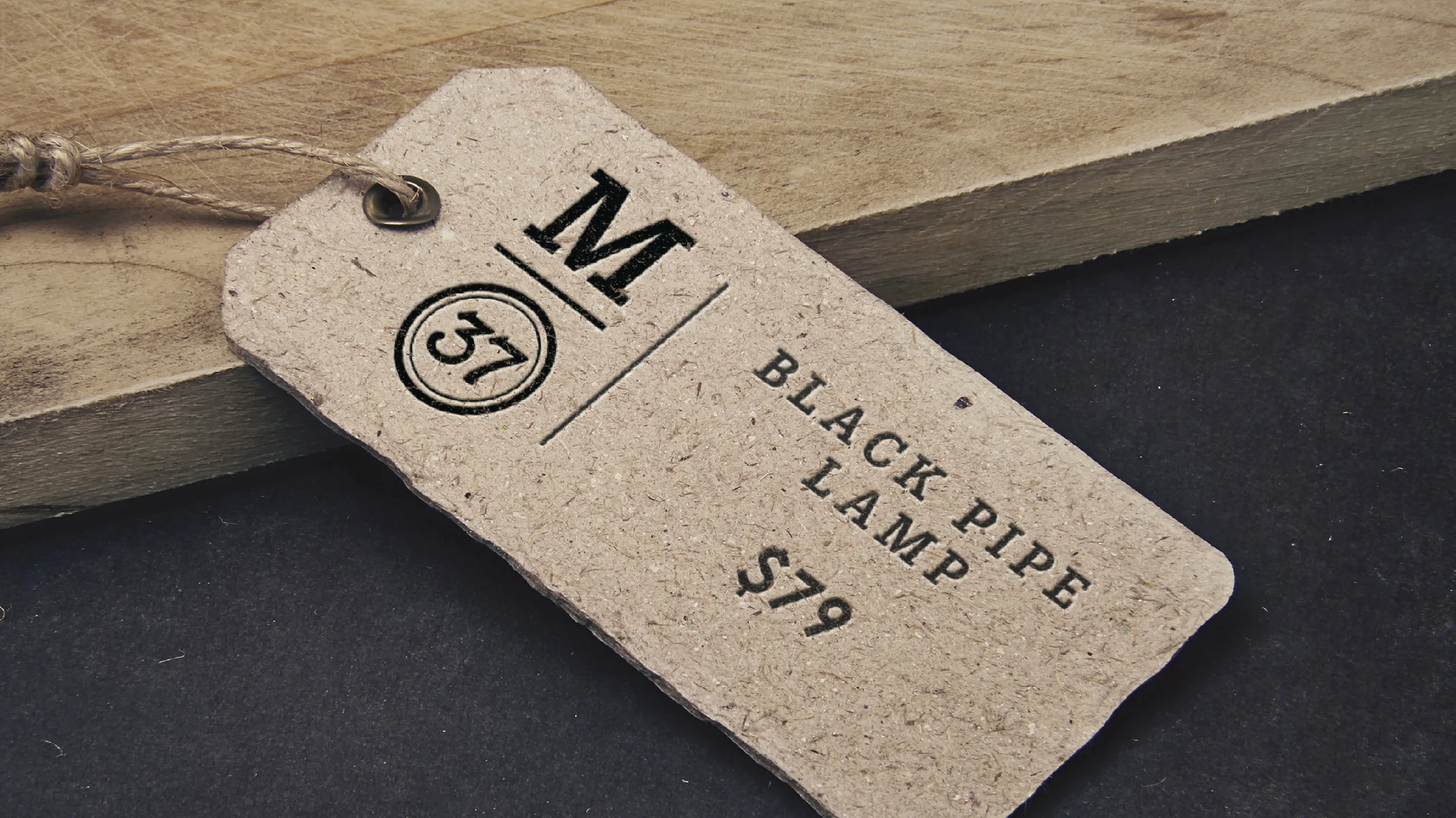
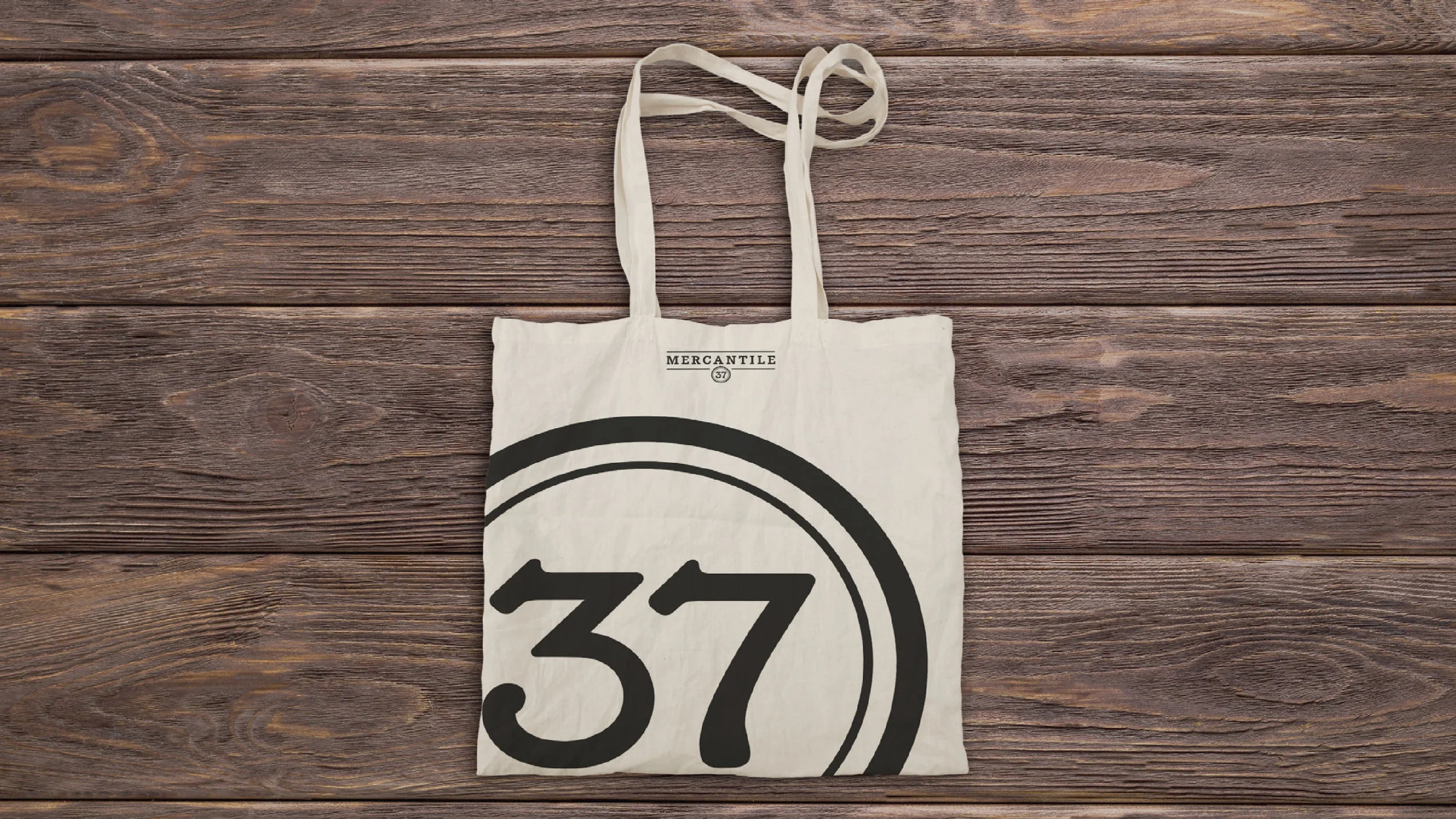
Our solution recognized that the Mercantile 37 was catering to people who want to emulate the DIY trend along with people who are willing to invest in local artists and makers. Using a more modern take on vintage signage, we used a slab serif typeface that felt refined and crafted, but not modern or sleek recalling forms found in vintage signage. The number “37” was an important part of the name, and we saw it as a mobile piece of iconography that could be expanded for the brand. Inspired by the type on old cash registers, the “37” was customized to fit the wordmark while also standing as an icon on its own.


